Practice ad
In today's class we have learned how to use Pixlr, a photo editor and free online Photoshop alternative. For this, we were asked to create our own poster or design for the art project as a first draft.
First of all I looked up stock images at Unsplashed to use as a background or main element of the design, This is the one I chose:

I decided to go for this picture because of two reasons
First, the use of the mask, which is what I'm trying to promote.
Second, the background colour, since based on my research it is the ideal background for my project ( see my research post for more information).
Here are some pictures of the process:
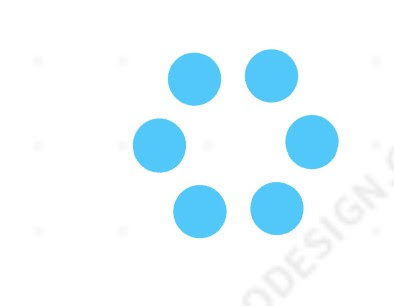
These are the initial shapes, from which I chose two

The first one is The DNA grey symbol, and the second one is the hoop or circles

Since the union of both elements felt too heavy I decided to edit the second shape, simplifying it and leaving only the smaller ring of circles:
To this, I added the other element. As well, I decided to change the colours of both symbols. For this, I did the following steps:

While selecting the desired object I clicked on the square under the word "color" on the right. From there, the colour selecting tab appeared, in which I chose the lightest blue in the fifth column. I then closed the colour selection tab and moved the blue and grey squares, which alters the proportion of each of the colours in the final piece, making an ombré effect. I wanted to have both colours in the composition, but since the other element is blue and the letters are too, I added more grey than blue to the DNA element to compensate. This is the final shape:

I left the ring of circles as it was and put the DNA inside it, creating this:

Finally, I added the letters. These are the chosen settings and next to them is the text:


And finally, the end result:

I then went to the page Pixlr E. I first uploaded the image I chose by going to the file section and clicking on open image. Then I inserted text by using the text tool. I chose the font Gustavo for all of the text except for the numbers, which are in Arial. The biggest title is in the size 160, the slogan is in size 60 and the smallest text in 40. The numbers are all size 205.

After arranging all of the text I pasted the logo in the lower right corner. This is the final result:

References:
( all of them were viewed the 15/10/2020)
Stock photos:
Red Teddy Bear by @lunart in Unsplash
My research blog:
The NHS logos I used for reference:
Web where I was going to download the NHS original logo from:
Page where I designed my own logo:

You have images of the process and some explanation which is good however you need to explain how you used pixlr and the process of creating this explaining which tools your used and how you did this - as I explained in class the assessment criteria is based on you demonstrating that you can use digital tools you have to prove this with evidence here
ReplyDeleteGood update - well done
ReplyDelete